
Introduction
It is thought that the size of a plant’s seed may have some effect on the geographic range of a plant. In fact, a positive correlation is believed to exist between acorn size and the geographical range of the North American Oaks. The idea behind this theory is that larger acorns will be carried away by larger animals who in turn have a wider territorial range. Aizen and Patterson studied 39 species of oak trees to examine this correlation.
Synopsis
Abstract
This example examines the relationship between the size of an acorn and the geographical range of the oak tree from which it comes.
Data Set
5 variables, 39 cases
Extensions
Table of results, map of study region, DASL.
8 Questions
Basic: Q1-Q3, Q6-Q8
Semi-tech: Q4-Q5
Protocol
Fifty species of oaks are found growing in the United States, 80% of which are accounted for in the Atlantic and California regions. The 28 oaks in the Atlantic region and the 11 oaks in the California region were used in this study. Acorn size was expressed as a volume, using measurements of specific nut lengths and widths to estimate the acorn volume as the volume of an ellipsoid. The areas of the geographical range for each species were obtained from the available literature.
Results
The data collected by Aizen and Patterson is given in the following table:
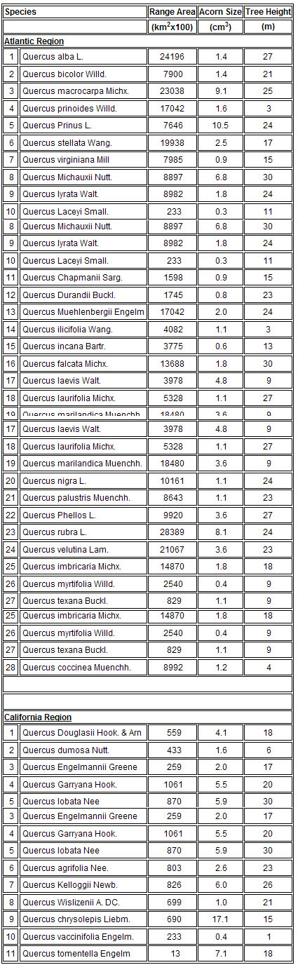
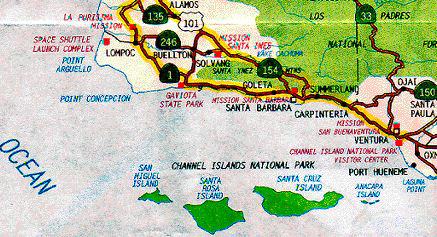
The range of species number 11 of the California region is unusual in that it does not include any land on the continental United States. This particular species of oak grows only on the Channel Islands of Southern California (see the map) and the island of Guadalupe off the coast of Baja California. The area of the Channel Islands is 1014 sq. km and the area of the island of Guadalupe is 265 sq. km.
Data
The following variables are contained in the stored data:
Species (Latin name)
Region (Atlantic or California)
Range = the geographic area covered by the species in km² x 100
Acorn size (cm³)
Tree height (m)
Questions
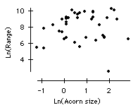
Make a scatter plot of tree range vs. acorn size. Find the correlation. Does there appear to be any linear relation between range and acorn size?
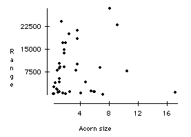
The correlation is 0.076. There does not seem to be much of a linear relation at all.
a) Examine the summary statistics for tree range. What are the mean and the standard deviation? What do these values tell you about the likely shape of the distribution?
b) Now regress Range on Acorn size. If you want to be able to predict tree range by knowing acorn size, how much does this regression equation help you? Explain.
a) The mean of range is 788256 km2, the SD is 805482 km2. Since the SD is larger than the mean, we would expect the distribution for oak tree geographical range to have a long right tail.
b)

This regression equation does not help at all. The R2 value is 0.6%. In other words, only 0.6% of variability in Range is explained by the regression on Acorn size. This is essentially zero (or equivalently, the rms error is no smaller than the standard deviation of the Range variable). Thus our predicted value of Range will not be any closer to the actual value with the regression equation than without it.
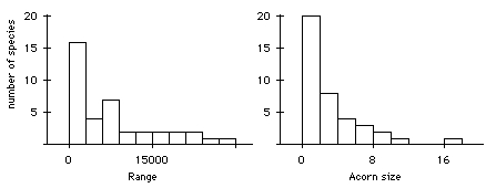
Examine a normal probability plot of tree range and a normal probability plot of acorn size. Do these data appear to follow the normal distribution? If not, what shape do they have? You may wish to look at the histograms of the variables.
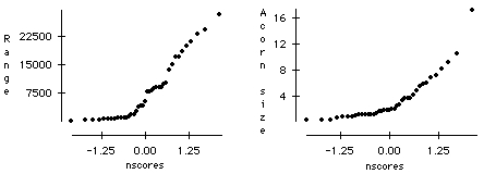
The authors suggest a transformation of the data. Based on what you learned from Question 3, which transformation would you suggest?
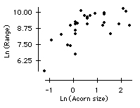
a) Transform the data using the log transformation on both the range and the size. Now make a scatter plot of Ln(range) vs. Ln(acorn size). How did the correlation change? Does the correlation surprise you? Do you see any obvious reason that might help explain the correlation?
b) Examine the normal probability plots of Ln(range) and Ln(acorn size). What do they tell you?
a)
The correlation is about the same, 0.079. The transformation has changed the shape of the cloud of points to show a more linear pattern, but the outlier in the bottom right hand corner of the scatter plot accounts for the low correlation.
b)
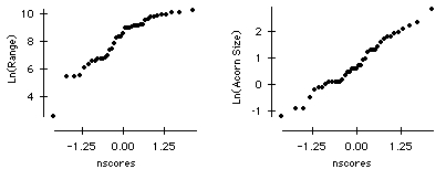
The normal probability plot of Ln(Acorn size) indicates approximate normality of this variable. The normal probability plot of Ln(Range) shows the presence of an extreme outlier.
Compare boxplots of tree range by geographical region in order to investigate the relationship between tree range and region. What do you learn?
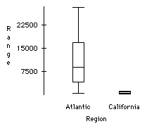
The comparative boxplots show that the bigger ranges are found in the Atlantic region, the smaller ranges are found in the California region.
a) Make a scatter plot of Ln(range) vs. Ln(acorn size) for the Atlantic region. Is the correlation any better than that found in Question 1?
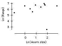
b) Make a scatter plot of Ln(range) vs. Ln(acorn size) for the California region. What is the correlation? Why do you think that the correlation is so low?
a) The scatter plot for the Atlantic Region shows a moderate positive association. The correlation has improved to 0.624.
b) The correlation is only 0.0203 for the California region. This low correlation is due to the presence of the outlier at the bottom right of the plot. The rest of the data seem to be associated in a stronger manner.
a) Examine the residuals from the regression of Ln(range) on Ln(acorn size) and the indicator for region. Does there seem to be an outlier? Can you identify the outlier?
b) What is unusual about the species of oak represented by this outlier? (Hint: Consult the map of the region.) How does this information help you understand this data point and explain the outlier?
a) A scatter plot of the residuals versus predicted values is shown below with the Atlantic region denoted by red •'s and the California region denoted by blue x's.
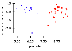
This plot illustrates the importance of incorporating information about the region into the prediction. Also, there does appear to be an outlier. The outlier represents Quercus tomentella Engelm, which is the species that only grows on the Channel Islands and the island of Guadalupe.
b) It is the only species of oak in the data set which does not grow on the continent. Its geographic range is limited by the size of the islands (about 1300 sq. km). This makes this species different from the other species in the data set. Since the range is limited yet the size of the acorn is not, this oak tree does not follow the same pattern as the others.
References
Aizen, M.A., and Patterson, W.A. III (1990)
Credits
This story was prepared by Mike Bowcut and Dennis Pearl. The map was prepared by Rebecca Busam. The last modification was made on 7/18/94.